Company
Company
MAVENLINK – 2020
Clarity. Control. Confidence.
As Mavenlink continued refine our positioning, we focused our messaging and brand story around a vertical SAAS strategy and 4 key messaging pillars that we felt resonated with out professional services clients. We engaged with Firebrick in San Francisco to help us define our narrative and then Mavenlink turned it over to my leadership to visualize the new strategy.
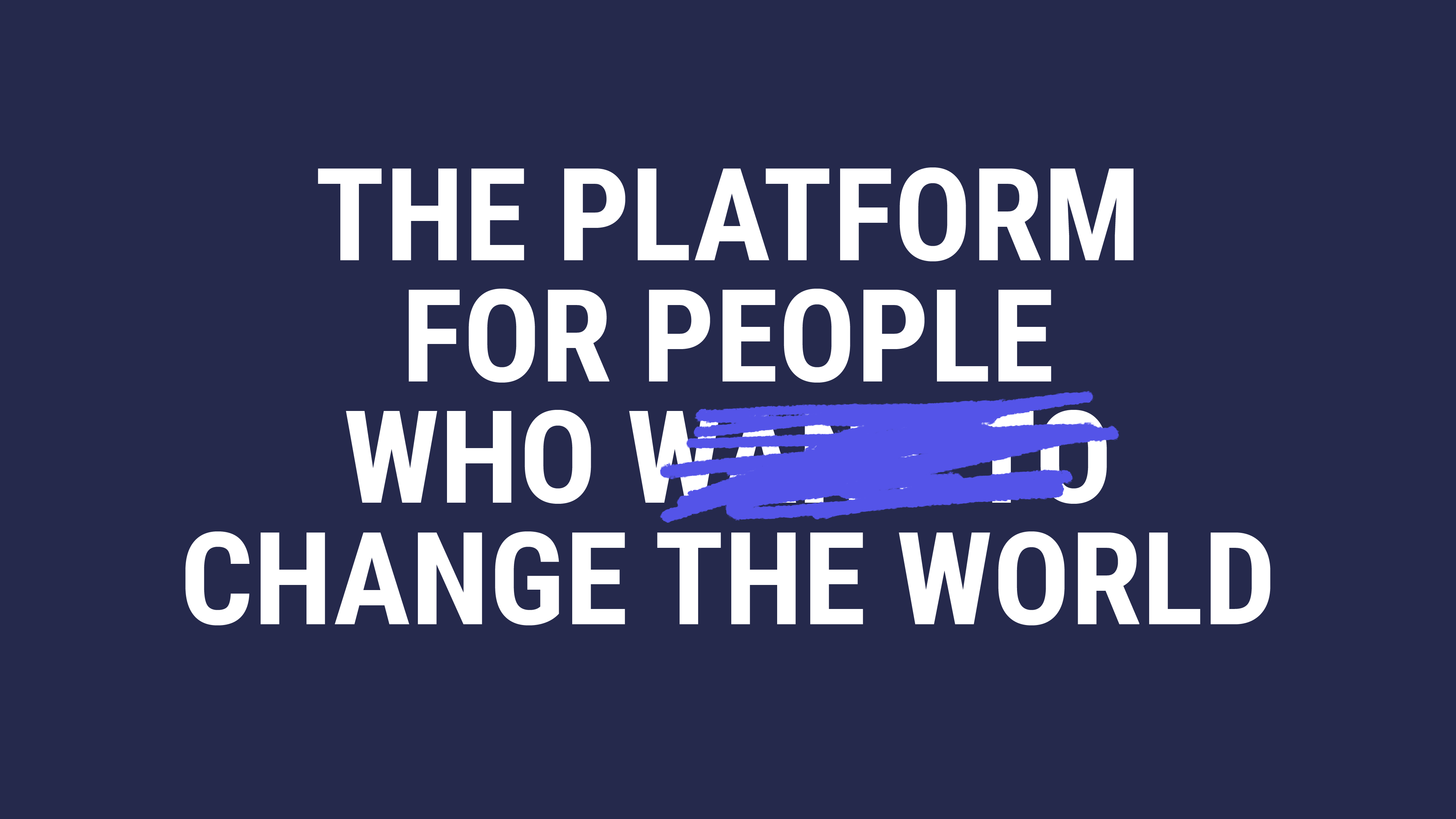
We wanted to wake the professional service market. The direction we aligned on was built around our purpose – To provide people-powered business the clarity, control and confidence they need to change the world.
The result was a striking visual system that is bold, urgent and inspired by the visual language of change and the big ambitious ideas of people we serve – who ultimately are the front lines of changing the world. The rebrand was incredibly well received in the market, led to sales growth and increased valuation in the company. In 2021 Mavenlink sold to new investors, who crafted a merger with our nearest competitor - Kimble.
A new 100M ARR company was formed as a result of that merger – Kantata. As the company's Executive Creative Director, I would also lead that rebrand.
As the Executive Creative Director I helped our executive team sharpen our positioning, refine our messaging, and update our brand platform. That jolt in company trajectory sparked a rebranding effort which I led. Spoiler alert – 3 years later growth targets were hit, our workforce had grown another 30%, and yet another market segment was opening for us to capture.
Branding
Identity & Branding
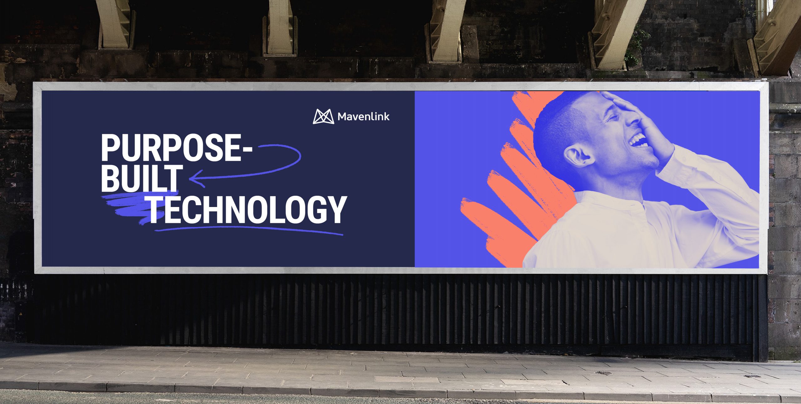
People in professional services live to tackle big, audacious problems. Their ideas are bold and ambitious. They want to make impact and leave their mark on the world one idea at time.
The visual system is inspired from the visual language of ideation - a whiteboard session, a quick napkin sketch, notes jotted in the margins of a book. The imagery and typography is bold, urgent and inspired by the visual language of change.
Our branding was a jolt the market and communicated that big ideas start small and they start with people are given the space the space to think big. Mavenlink clears the way for human ingenuity to shine.
My Role
Creative Direction, Brand Strategy
Creative Direction, Brand Identity, Visual Design, Brand Guidelines, Strategy, Brand Platform & Positioning
Credits
Rob Pickell – CMO, Darrin Crescenzi – Art Director, Lead Designer, Tannie Low – Sr. Designer, Jennifer Dodos – VP Marketing Communications, Bob MacDonald - Sr. Strategist; Firebrick, Bob Wright, Partner; Firebrick

Mavenlink.com
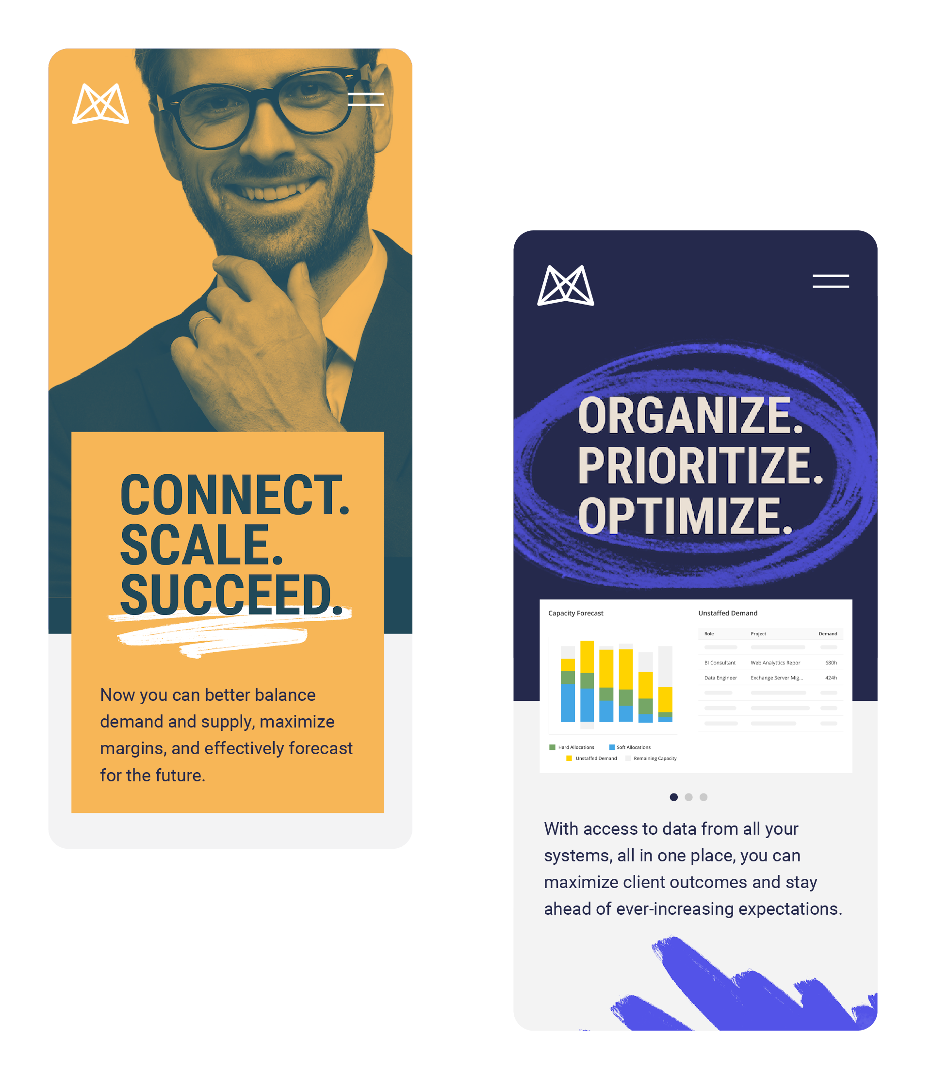
Our website's fresh pallete, dynamic typography, and duotoned poster imagery spoke directly to the persona of and ambition of the professional service industry. The site bold, urgent , completly unique among competion, and woke up the market. It was both charasmatic and and changemaker.
Our website's fresh pallete, dynamic typography, and duotoned poster imagery spoke directly to the persona of and ambition of the professional service industry. The site bold, urgent , completly unique among competion, and woke up the market. It was both charasmatic and and changemaker.
My Role
Creative Direction, Site Strategy
Credits
Darrin Crescenzi – Art Director, Lead Designer, Tannie Low – Sr. Designer, Jennifer Dodos – VP Marketing Communications, Toni Pace – Website Mananger, Matt Draper – Copywriting, Dominique McBee – Design Operations, Ryan Montano – Director Product Marketing, John Shockey – Developer, MAB Agency – Development

Marketing
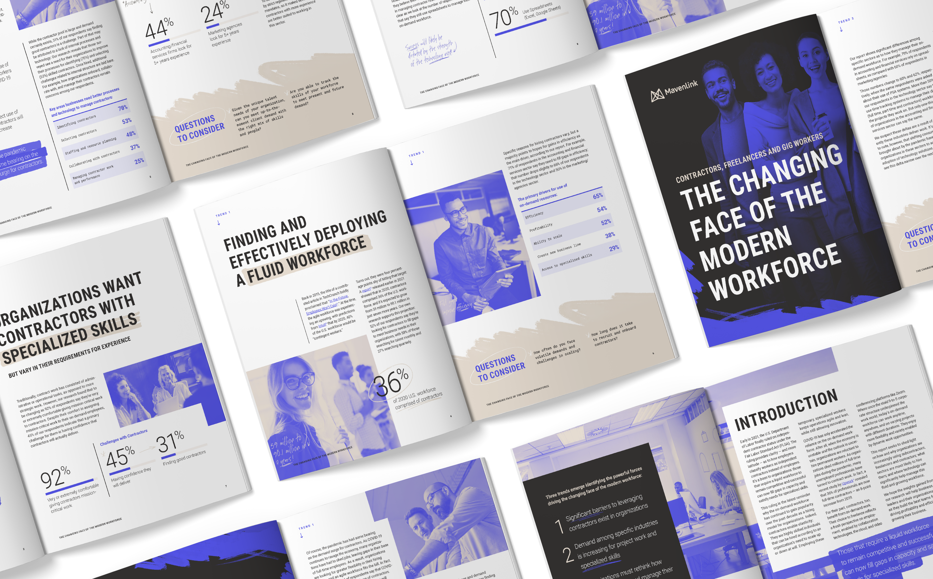
With such a variety of elements to pull from, the system remained fresh and impactful as we rolled it out to all touchpoints. It abilty to "jolt" the viewer and grab attention was a strength inherent a system that was inspired by the artistry of hand painted signs, murals, event posters and flyers of movements around the world.
My Role
Creative Direction
Credits
Darrin Crescenzi – Art Director, Lead Designer, Tannie Low, Sara Kunz, – Sr. Designers, Jennifer Dodos – VP Marketing Communications, Matt Draper,– Copywriting, Dominique McBee – Design Operations




Selected Works

Whole Foods Package DesignProject type

Mavenlink Branding 2015Project type

Mavenlink Branding 2018Project type

Dotmatics Brand DesignProject type
Apcera Brand DesignProject type
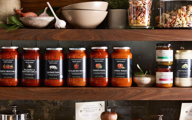
Williams-Sonoma Package DesignProject type
Aaron Pedroza | Creative Director | NYC SF | get in touch
Aaron Pedroza
Creative Director | NYC SF | get in touch


