Company
APCERA
A cloud connected service brings trust to the table.
Apcera is postioned as a next-generation platform as-a-service (PaaS) which works across cloud, on premise and hybrid environments to run securely containerized workloads in production.
The targeted personas are very technical and experienced – Technology Executives, Dev Ops and Infrastructure teams, System Admins and Developers. The market segment had defined pains and needs - mostly enterprise companies, with needs around policy consistency, strict IT governance and universal compliance for deployment.
I was hired to develop a new identity and web experience reflecting the positioning and messaging. I engaged closely with the marketing team, absorbing and playing back in agile fashion iterations of design artifacts – brand affinity diagrams, competitive teardowns, content storyboarding, diagrammatic flows, designed to align and propel our collective thinking.
This collaborative workflow evolved our thinking, sharpened our point of view, and ramped me up to speed as quickly as possible on an offering and market I was pretty new to.
In the end, working closely with the Apcera team we successfully launched a new identity and website with differentiated positioning and strong resonant messaging. Soon after the launch, Apcera was aquired strategically by Ericsson, the leader in policy-based automation and governance of telecom networks, to “deliver complete cloud automation to run all workloads and use cases, while providing complete control for infrastructure.“

Identity
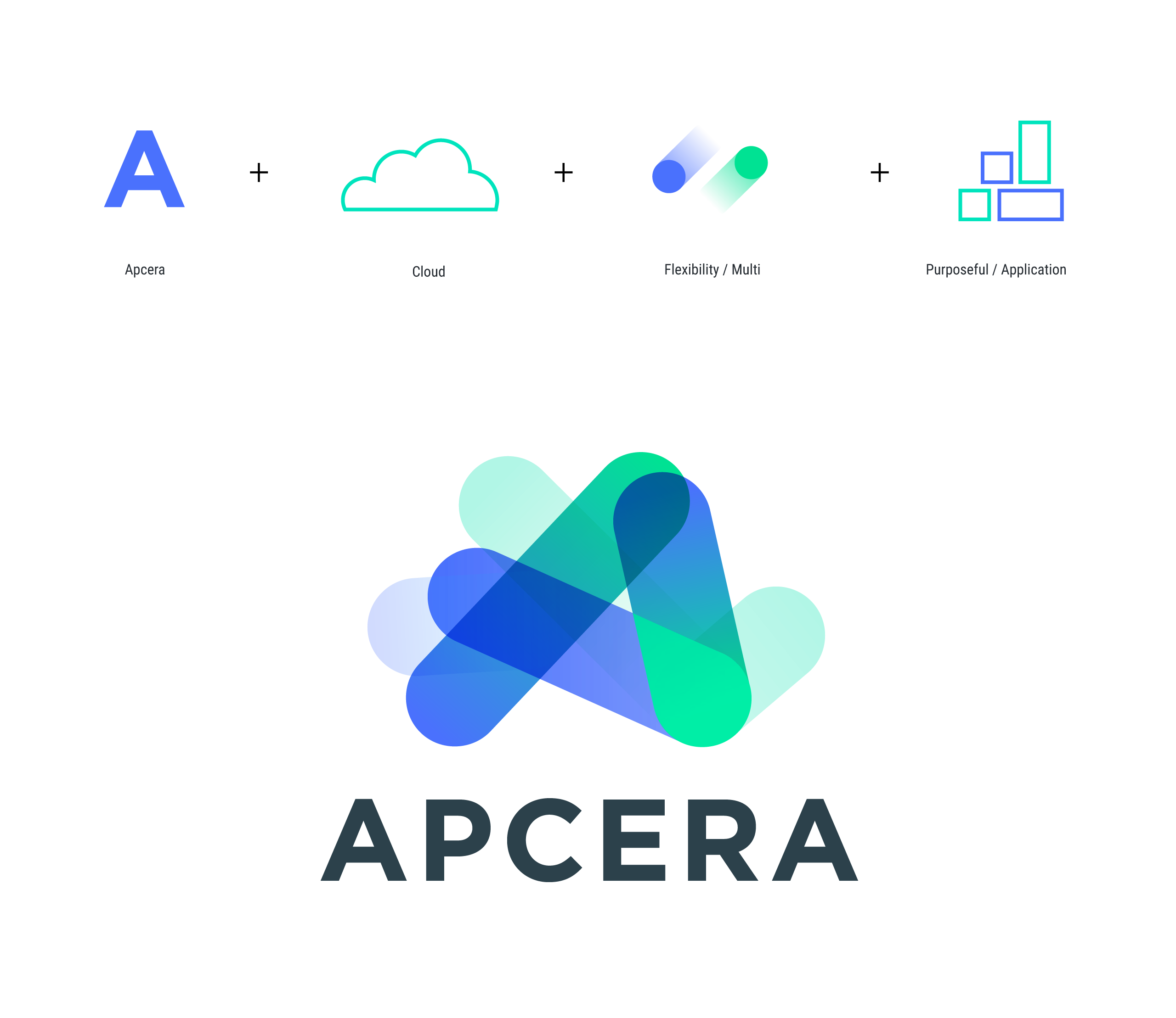
I created a new identity for Apcera reflectings the themes of containers, multi-cloud ,and flexible. The 3 main lozenge shapes were a nod to the 3 types of hosting – cloud, on premise and hybrid, while the ghosted 3 shapes telling the story of flexibility and configurability. The 6 shapes combine to create a single shape that shape visually outlines cloud based and unified, but ultimately an identity with innovation and dynamism as its most visual key takeaway.
I created a new identity for Apcera reflectings the themes of containers, multi-cloud ,and flexible. The 3 main lozenge shapes were a nod to the 3 types of hosting – cloud, on premise and hybrid, while the ghosted 3 shapes telling the story of flexibility and configurability. The 6 shapes combine to create a single shape that shape visually outlines cloud based and unified, but ultimately an identity with innovation and dynamism as its most visual key takeaway.
My Role
Brand Identity, Creative Direction
Credits
Jeff Thomas – Chief Marketing Officer
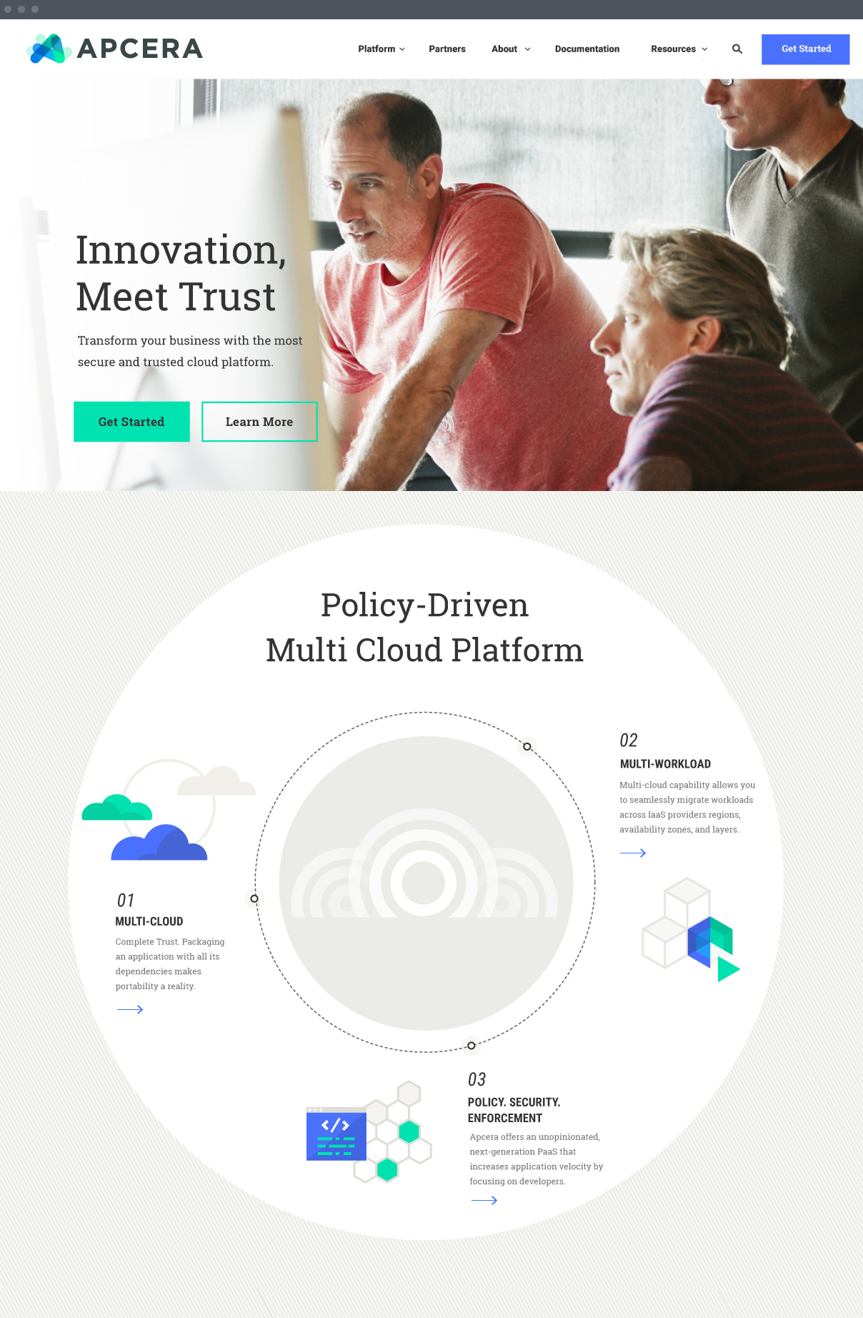
Apcera.com
The offering is complex to unpack, but the audience is savvy, and the need is there. We had to sell the what, excite the why, and diagram the how. The positioning was Apcera is a PaaS platform to securely run containerized workloads across all types of configurations. Apcera is is extremely flexible, works across platforms, and policy driven to digitize trust.
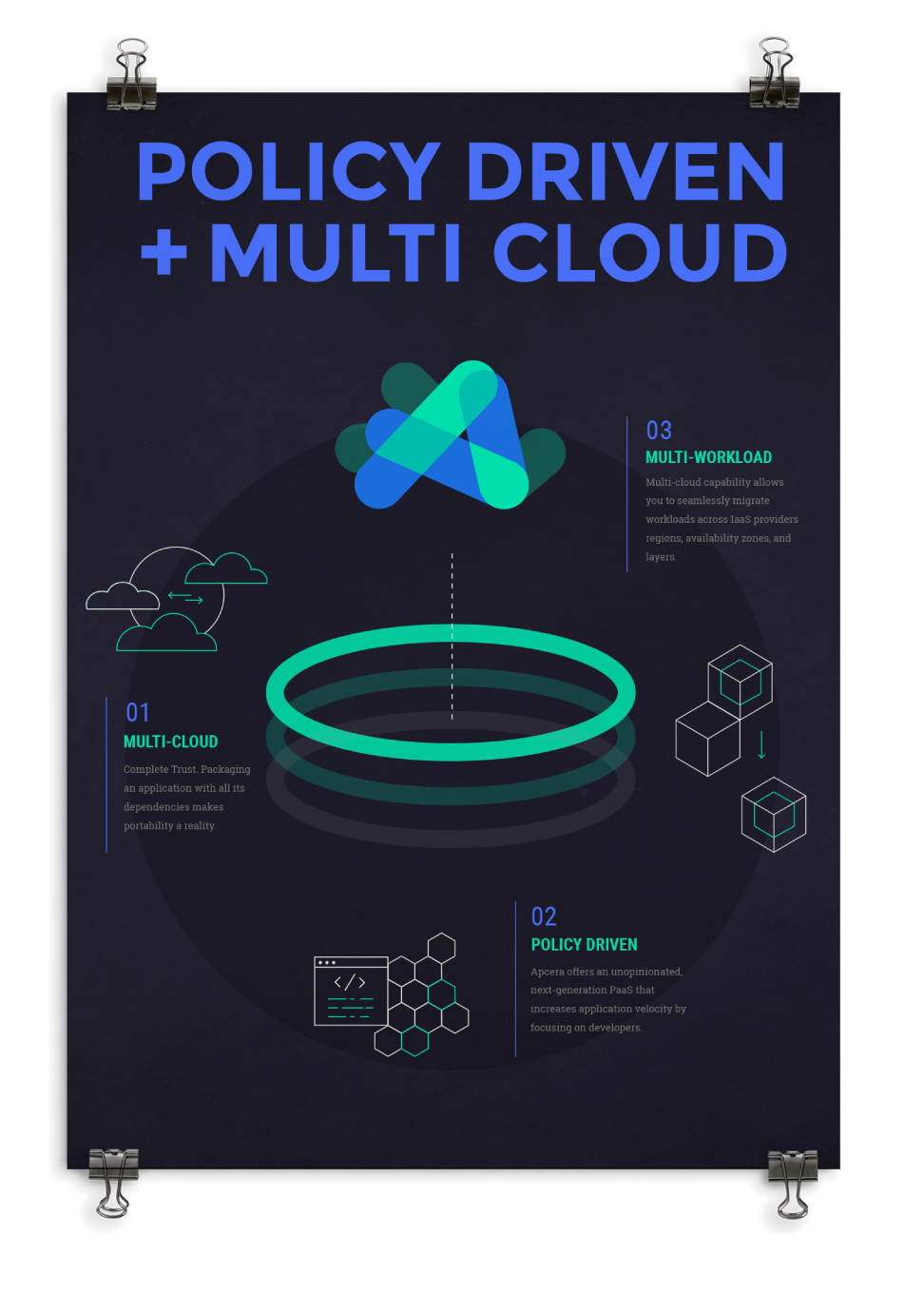
The two brand themes that drove the visuals were trust and innovation. Trust, though policy, governance, and enforcement mechanisms of the platform. Innovation, though flexibility, speed and scale benefits. We loaded up on success stories and benefit based messaging. Illustrations were created to diagram abstract concepts, in a style that felt simple, arrangeable, and creative.
My Role
Visual Design, User Experience, Creative Direction, Illustration, Icongraphy
Credits
Jeff Thomas – Chief Marketing Officer, Sonya Balzer – Demand Generation, Tracey Bradley – Marketing Communications, Joseph Hogya – Website Manager, Nica Lorber Chapter Three – Development Agency, Kevin Anderson The B Complex – Product Video Agency





Brand Guidelines
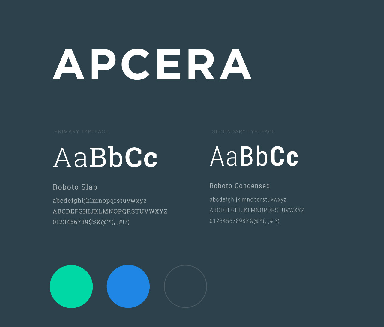
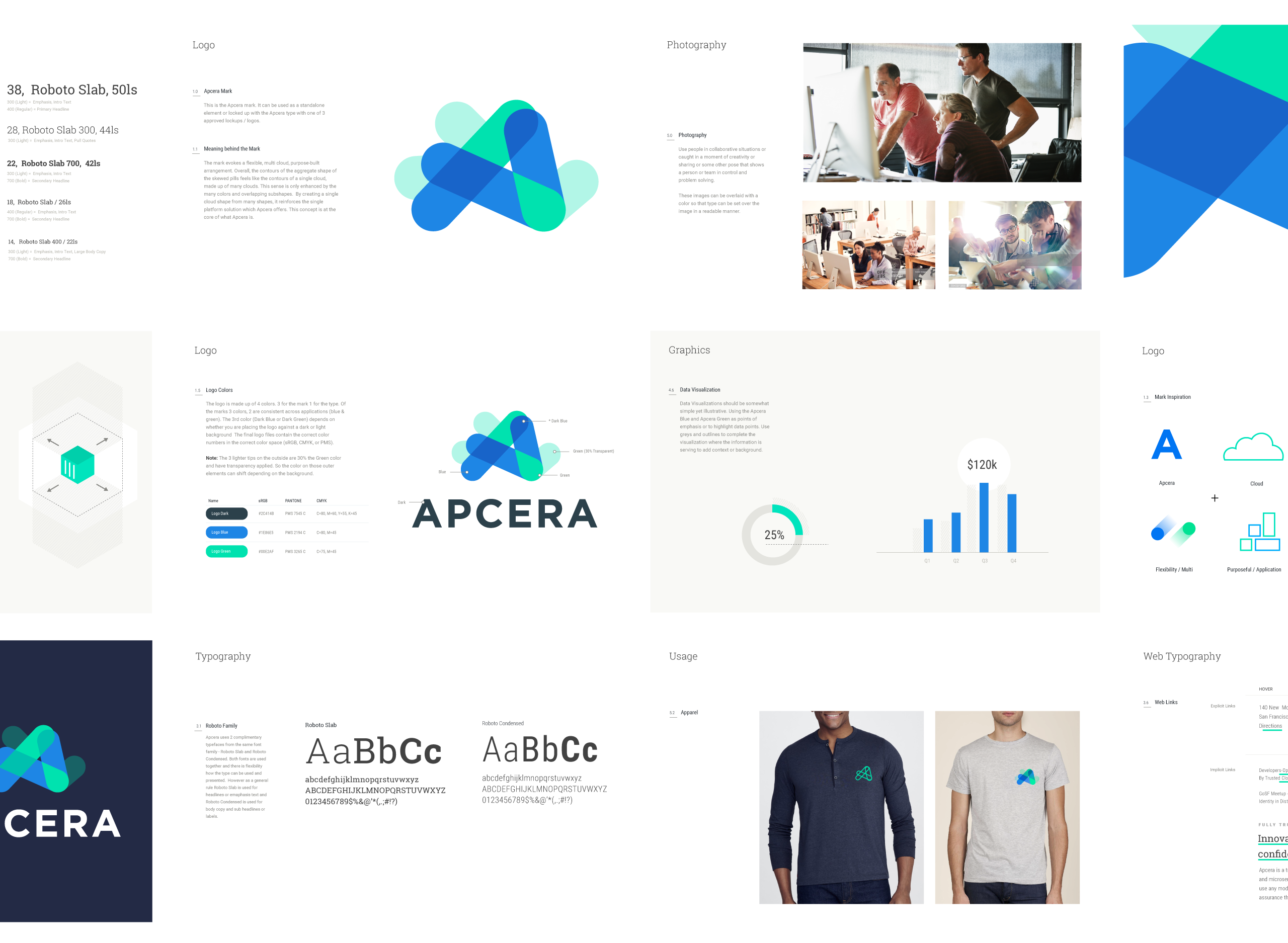
As a natural followup to the website, I created and designed guidelines for the new identity and brand. I outlined rules and rationale, defined design mechanics and typography, and provided guidance for photography and illustration.
My Role
Brand Guidelines, Visual Design, Creative Direction

Illustration
With abstract and hard-to-wrap-your-head-around concepts, illustrations were a must to convey the description or the benefit. I created an initial set of illustrations in a visual style that reflected themes of flexibility, creativity, action, simplicity, and workflow.
My Role
Visual Design, Illustration


Marketing
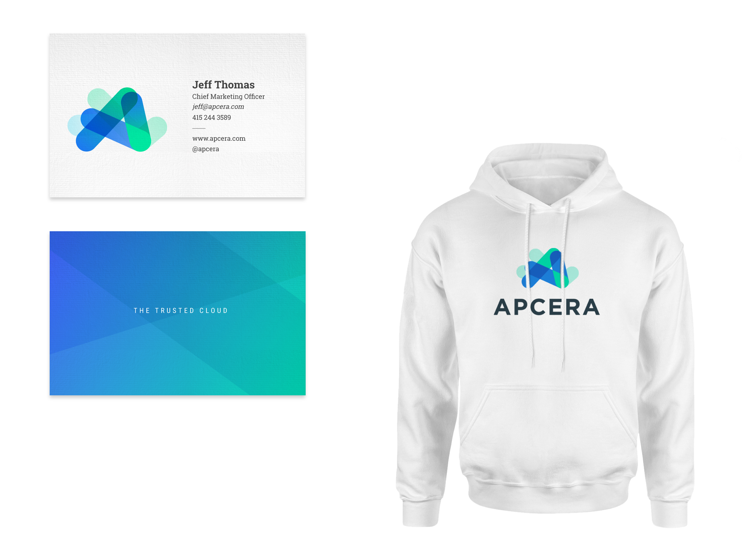
The system was extended to other touchpoints – collateral, slideware, and swag. I transitioned the design system to Apecra’s design lead and provided direction and guidance to ensure the success of the system as extended.
My Role
Visual Design, Creative Direction, Illustration
Credits
Jeff Thomas – Chief Marketing Officer, Tracey Bradley – Marketing Communications, Justin Brinkmeyer – Desinger

Selected Works

Whole Foods Package DesignProject type

Mavenlink Branding 2015Project type

Mavenlink Branding 2018Project type

Mavenlink Branding 2020Project type

Dotmatics Brand DesignProject type

Williams-Sonoma Package DesignProject type
Aaron Pedroza | Creative Director | NYC SF | get in touch
Aaron Pedroza
Creative Director | NYC SF | get in touch
